

The English waiting list reached a new record size of 7,472,052 patient pathways at the end of May, up 56,700 over the month, and going in the wrong direction to achieve The Prime Minister’s New Year pledge that “NHS waiting lists will fall”.
Analysis produced for Health Service Journal by Dr Rob Findlay, Director of Strategic Solutions at Insource Ltd and founder of Gooroo Ltd
The target to eliminate 65 week waits by March 2024 also slipped further out of reach, with the numbers waiting beyond the target rising by 1,666 pathways to 96,801 during May. The targets to eliminate 104 and 78 week waits are still not being achieved, long after their deadlines.
The latest Statistical Press Notice featured an unexpected new piece of data: “The number of unique patients is estimated to be around 6.3 million*.” The asterisk directs us to a footnote explaining “This is based on analysis of the Waiting List Minimum Data Set” (WLMDS).
There are two things to say about this.
Firstly, it is a bit rich of NHS England to publish data selectively from the WLMDS when it suits them. The public are paying for this data collection and should be entitled to see proper and comprehensive statistics from it.
Secondly, what purpose does this number serve? As health ministers point out, patients are “not really worried about who else is on the waiting list”. Nor does it indicate the amount of work the NHS needs to do to clear the backlog – that is better represented by the usual measure of incomplete pathways.
So it is difficult to escape the conclusion that this number is being quoted for no better reason than it being smaller, in a possible attempt to confuse the public into thinking that waiting lists are falling. The onus is on NHS England to explain.
In the following discussion, all figures come from NHS England. For analysis of waiting times performance and the outlook for your local services eliminating 65 week waits, visit our reports page or our map of the latest elective waiting times across England.
The numbers
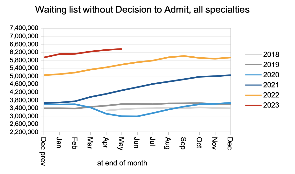
Let’s start by looking at both the numbers of patients starting new waiting time ‘clocks’, and the number of patients being removed from the waiting list without being admitted for treatment, as shown in the following two charts.


Clock starts (a measure of demand) rose to slightly above pre-pandemic rates, and non-admitted clock stops (patients removed from the waiting list without being admitted for treatment) rose to significantly above pre-pandemic rates. The increase in clock starts was the larger of the two; nevertheless the significant rise in non-admitted clock stops has to be great news… doesn’t it? I am not so sure, and find it curious how often these two numbers seem to rise and fall at the same time. I even wonder (without evidence) whether they indicate some kind of revolving door, where patients are removed from the waiting list only to be added back to it straight away with zero time on the clock. If anyone can shed any light on this then I would be interested to know.
The net result of clock starts increasing faster than non-admitted clock stops (plus those converting to the waiting list for admission) was an increase in the number of patients on the waiting list without a decision to admit. Of these 6.4 million patients who have not yet reached diagnosis and decision, I estimate that some 27,000 will eventually receive a cancer diagnosis. They are not protected by the cancer waiting times targets, because they were not referred on a cancer pathway, because their cancer is not yet suspected.
Admissions for inpatient and daycase treatment remained at pre-pandemic levels.
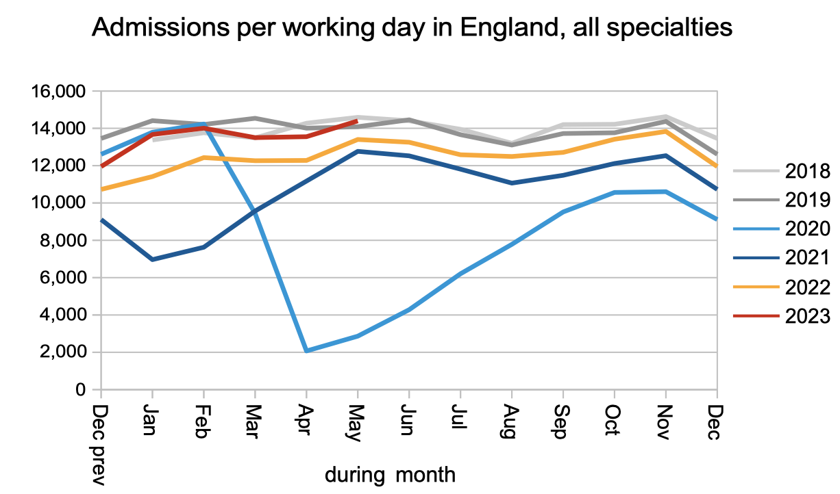
The overall result was that the waiting list grew to a record 7,472,052 patient pathways. The red triangle below shows that the waiting list will need to at least halve in size before the statutory 18 week target is likely to be achievable again.

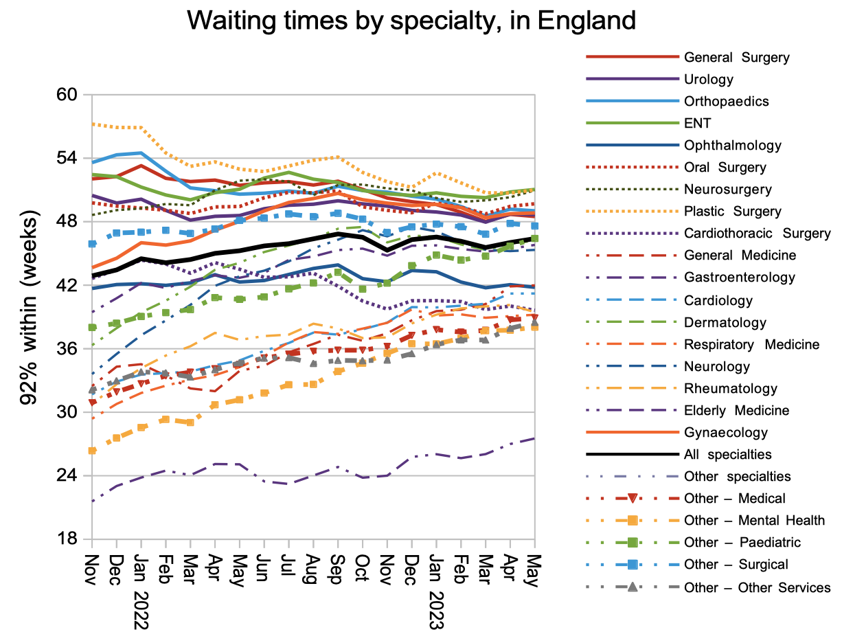
Waiting times have been slowly increasing since the worst of the pandemic, both overall and for those patients who have not yet reached diagnosis and decision. The estimated 27,000 patients mentioned above, whose eventual diagnosis will turn out to be an unexpected cancer, are currently facing a typical wait of 44.2 weeks (10.2 months) for that diagnosis which is far too long.

Waiting times are a function of both the size and shape of the waiting list, and the index below indicates the shape. It remains worse than pre-pandemic, largely because of the huge variation in waiting time pressures around the country.

While the longest waiting times have come down at specialty level in response to the waiting time targets, the shorter specialty waits have been increasing. This is another indication that current waiting times policy is not reducing the underlying pressures in the system.
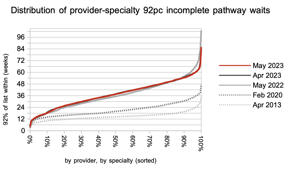
There was little change in the distribution of waiting times in May. I noted above that the waiting list shape is largely driven by the variation in waiting times across more than 2,000 local specialties across the country, and the chart below shows how much greater that variation is now, than before the pandemic.
Those local services above the “92 per cent within 42 weeks” line are likely to breach the target to eliminate 65 week waits unless they can reduce the size of their waiting lists.
Referral-to-treatment data up to the end of June is due out at 9:30am on Thursday 10th August.