

The remorseless growth of the English waiting list continued in October, reaching 5,975,216 at month end. Patients are both joining the waiting list and being discharged from clinic at near pre-covid rates, but admissions for treatment are still constrained, with the net result that the waiting list is growing rapidly.
That’s what’s happening, but there are also some things that are not happening which are worth keeping an eye on.
There is still no sign of any surge in referrals caused by the millions of ‘missing referrals’ since March 2020 coming back for treatment. The Institute for Fiscal Studies has been looking into why this might be, and concluded that we don’t really know, but probably patients are still avoiding the NHS because of the ongoing pandemic. This is worrying because a lot of these missing patients should really be seeking healthcare.
Nor is there any noticeable uptick in patients being removed from the waiting list in response to the incentive in the planning guidance to complete more pathway activity. This is good news, because it shows that trusts are not ‘gaming the system’, to get a share of the £1bn Elective Recovery Fund by removing large numbers of patients from the waiting list administratively. The bad news is that even an incentive this big is not causing more patients to be seen and treated.
In the following discussion, all figures come from NHS England. If you have a national statistic that you’d like to check up on, you can download our waiting times fact checker.
For analysis of waiting times performance at a particular organisation, visit our reports page, or our map of the latest RTT waiting times across England.
The numbers
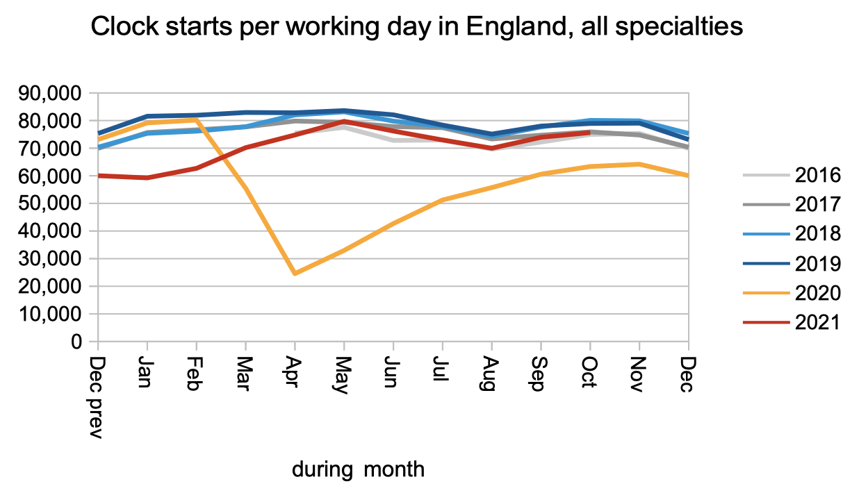
Patients are still being referred to hospital and starting new waiting time ‘clocks’ at close to pre-covid rates. There is no sign yet of the ‘missing referrals’ (represented by the gap between the orange/red lines and the other lines) surging back.
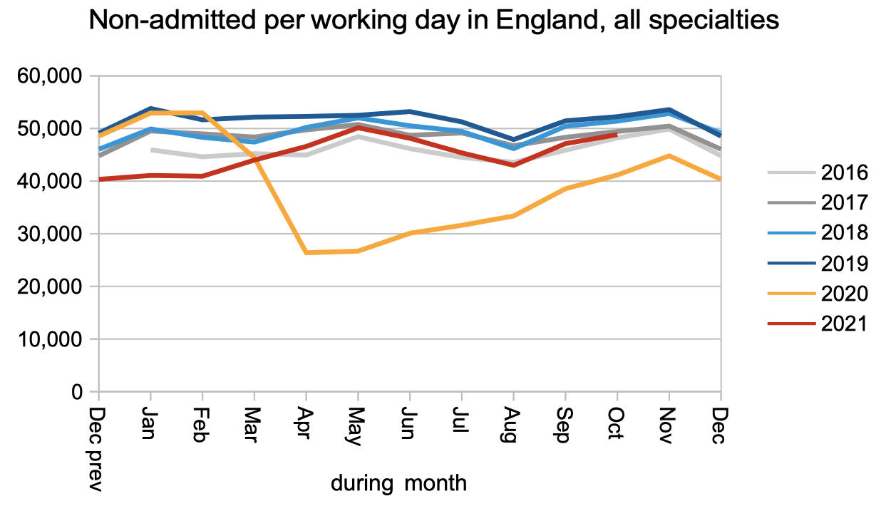
Patients are also being discharged from outpatients (or otherwise completing their waiting time ‘pathway’ without being admitted) at near pre-covid rates.
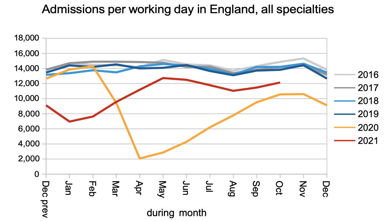
Patients are still physically coming into hospital for inpatient or daycase treatment at below pre-covid rates. This is a sign that capacity remains constrained by the ongoing pandemic.
The net result of near-normal referral rates but below-normal activity is a rapidly growing waiting list. At the end of October there were a reported 5,975,216 open patient pathways on the English referral-to-treatment waiting list.

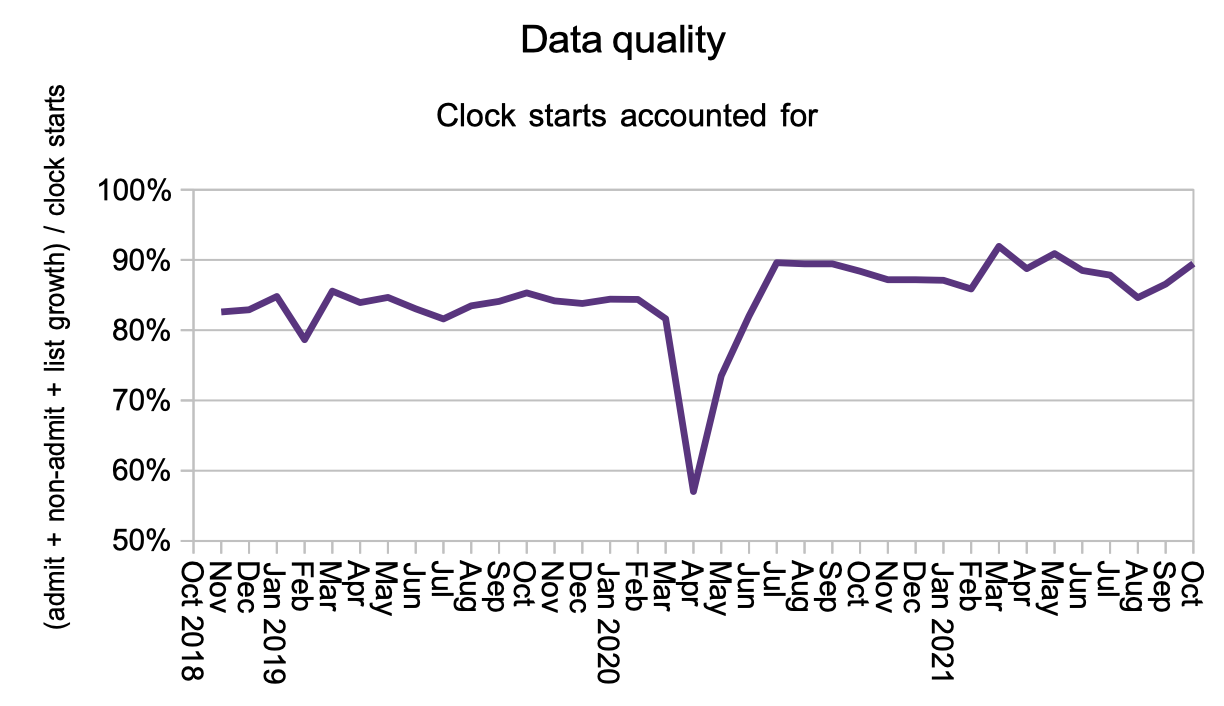
The next chart is new, and I am introducing it to help monitor the incentive created by the Elective Recovery Fund to “achieve completed referral to treatment (RTT) pathway activity above a 2019/20 threshold of 89%”.
There are several ways trusts could increase their completed pathway activity.
They could increase the number of patients being seen and treated, which would benefit real patients, and this would show up as increased admitted and non-admitted activity rates in the second and third charts above.
Or they could remove more patients from the waiting list administratively, by stepping up efforts to ‘validate’ patient pathways and remove those who should not be on the list. Any patients who are removed should show up as non-admitted clock stops, but if they don’t then they would contribute to a dip in the chart below, which shows what proportion of clock starts are accounted for elsewhere in the data.
Neither activity nor unexplained removals from the waiting list show any significant change, suggesting that so far the Elective Recovery Fund incentive is outweighed by the ongoing pressures on the NHS.
Waiting times have remained broadly stable during the summer, with the wait from referral to diagnosis and decision running at around 38 weeks, and the wait from referral to treatment running at around 44 weeks. (If you are tempted to subtract one number from the other: don’t. There is a broad range underlying both those statistics which means that stage-of-treatment waiting times don’t add.)

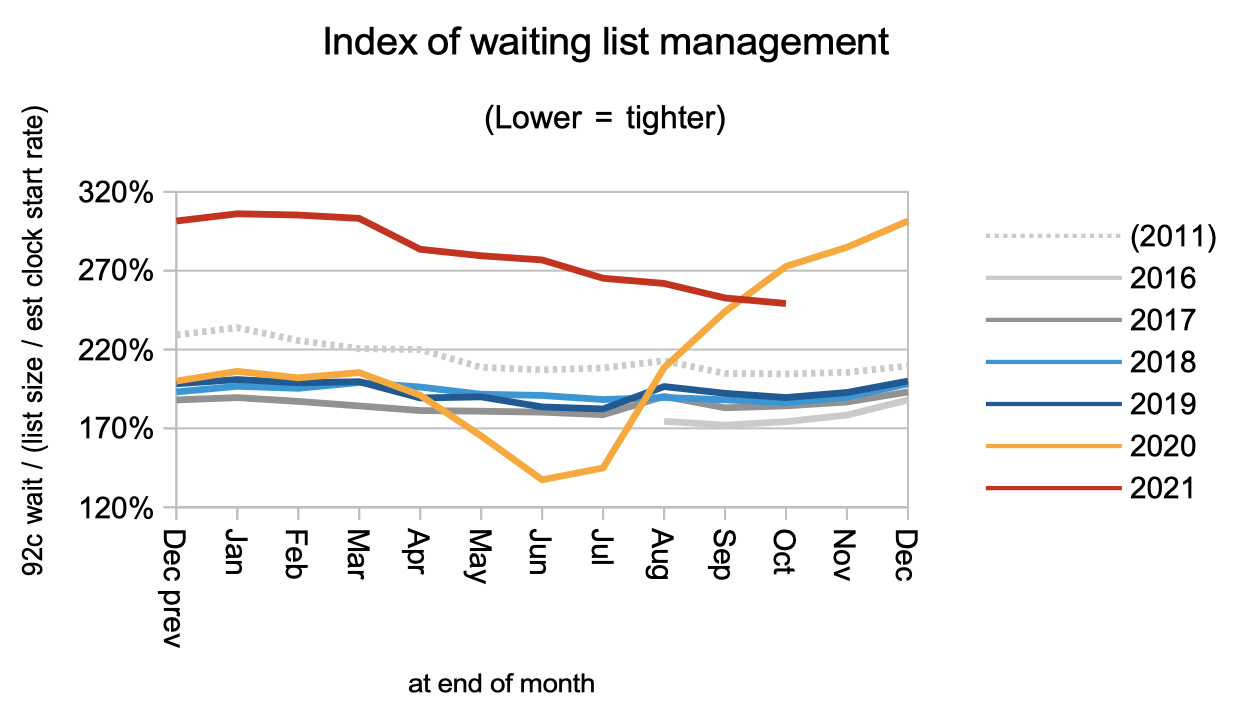
The next chart is making a comeback to this analysis for the first time since covid restrictions began. Waiting times are a function of two things: the size of the waiting list, and the shape of the waiting list. We looked at the size of the list earlier. The next chart is an index of the shape.
When the ‘incomplete pathways’ target was introduced in 2012 the shape of the waiting list improved sharply, and remained improved until the pandemic totally disrupted it in 2020. It is now slowly improving again, but there is a long way to go, and it will likely remain high (signifying a long ‘tail’ on the waiting list) until the NHS is again able to devote serious effort to managing waiting times across the board.
Waiting times vary enormously by specialty, with some having national waiting times longer than a year.

There is likewise huge variation in waiting times across the thousands of local services in England. This variation barely changed in October.
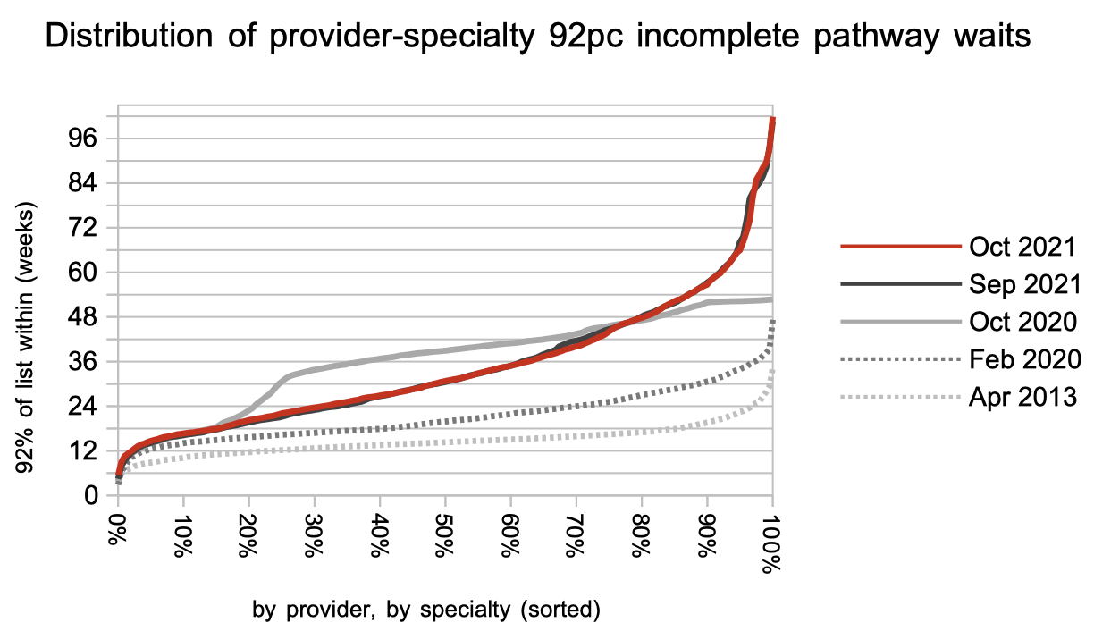
The proportion of local services achieving a 52 week wait has stopped improving. (The chart below tracks where the chart above crosses the 52 week mark.)

Referral-to-treatment data up to the end of November is due out at 9:30am on Thursday 13th January 2022.